|
|
Post by lowlights on Feb 28, 2007 2:32:20 GMT 8
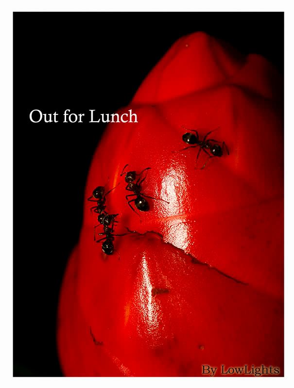 Took this shot to try out abstract.. your C&C ... thanks in advance.. |
|
ang79
Registered Member 
Posts: 490
|
Post by ang79 on Feb 28, 2007 12:53:55 GMT 8
woooowwww!!!! is that a 2 headed ant?  |
|
|
|
Post by 28degree on Feb 28, 2007 14:14:58 GMT 8
woooowwww!!!! is that a 2 headed ant? ang, thats the backside haa...opps...perhaps not a gd term to use.... whats the scientific term for that ah??  |
|
cecil
Registered Member
Posts: 191
|
Post by cecil on Feb 28, 2007 16:01:15 GMT 8
Posterior?
|
|
|
|
Post by gilbertgoh on Feb 28, 2007 16:44:24 GMT 8
hahaha
but lowlight,
i think title should be "Having Lunch"
|
|
|
|
Post by lowlights on Feb 28, 2007 21:17:10 GMT 8
Yes sir.. C&C please.. thanks |
|
ang79
Registered Member
Posts: 490
|
Post by ang79 on Mar 1, 2007 15:20:11 GMT 8
woooowwww!!!! is that a 2 headed ant? ang, thats the backside haa...opps...perhaps not a gd term to use.... whats the scientific term for that ah?? oh oh....blur me! should have seen it clearer! haha....tot got siamese twins ant! haha |
|
luvin
Registered Member
Posts: 213
|
Post by luvin on Mar 1, 2007 21:31:35 GMT 8
Brudder...
Looks good... even without the ants... I reckon your shot looks sweet.
Cheers
|
|
snipper
Registered Member
Posts: 627
|
Post by snipper on Mar 1, 2007 21:57:57 GMT 8
nice.. you use red filter or PS to increase the reds?
|
|
|
|
Post by lowlights on Mar 1, 2007 22:06:12 GMT 8
nice.. you use red filter or PS to increase the reds? Thanks.. the fruit was quite red by itself.. just pump up the saturation in PS a little.. |
|
snipper
Registered Member
Posts: 627
|
Post by snipper on Mar 2, 2007 11:59:09 GMT 8
Good try. would be better if the flash reflections can be avoided..
|
|
|
|
Post by lowlights on Mar 3, 2007 12:05:11 GMT 8
Good try. would be better if the flash reflections can be avoided.. Ok noted.. thanks |
|
Marcus
Registered Member
Posts: 455 
|
Post by Marcus on Mar 4, 2007 10:18:33 GMT 8
FYI, Font typeface do play an important part in a presentation. There are two types of font typefaces namely Serif and Sans Serif. The different between these 2 typefaces is: 1) Serif (Times New Roman, Bookman, Century, Garamond, Lucida etc...) Extra tails on the end of each letter. 2) San Serif (Arial, Century Gothic, Helvetica, Lucida Sans, Tahoma and Verdana etc...). Does not have extra tails at the ends of the letters. So what to choose between these 2 font typefaces? 1) Serif The eye takes longer to read a serif font, so it is best used as a title font on a slide so that the viewer spends a little more time reading the title to understand the topic of the slide. Use in New paper, article presentation. 2) San Serif A sans-serif font is easier to read, so it is best used for body text on a slide so that the viewer can quickly read the point and return their attention to the speaker. Use in web, magazine, product box presentation. For more information: en.wikipedia.org/wiki/TypefacesCheers |
|
USM
Senior Moderator 
Posts: 1,303
|
Post by USM on Mar 4, 2007 13:20:43 GMT 8
Good try. would be better if the flash reflections can be avoided.. I echo Deswitch's obervation too, i.e. the 2 white patches caused by the reflection by the flashgun. Have you tried to use a diffuser or decrease the flash output through flash compensation? |
|
|
|
Post by lowlights on Mar 5, 2007 0:56:19 GMT 8
Netbabay.. great stuff.. I waas having problem trying ti decide what typeface to use.. thanks.. will try out..
|
|